4.2 Comparison of the Classification Techniques
This section presents a comparison of the performance of the
classification methods, namely quantile, natural breaks (Jenks), equal
interval, and geometric interval, in distributing values among risk levels.
Once again to attenuate the effect of the combination schemes, the scores of
each classification were averaged for the 3 approaches. A summary of the
results is displayed in Appendix A, Table 17, while Figure 7 facilitates the
comparison of the distribution of the area among the four risk stages.
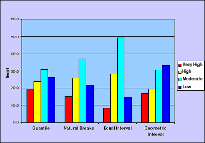
Figure 7: Environmental
Health Risks in Port-au-Prince - Percent of area at-risk by classification
technique
Two different patterns are exhibited regarding the distribution
of risk levels. First, whereas the maximum gap among risk levels is very
important for Natural Breaks and Equal Interval (21 and 41%), the Quantile and
the Geometric Interval techniques show a maximum difference of 16%. The second
pattern relates to the cluster of values in opposite categories (low and high).
In this regard, though all the classification techniques have a higher
proportion of values classified as low and moderate risk, equal interval and
geometric interval place a smaller proportion of areas in high and very high
risk (36%) than do Quantile and Natural Breaks (43% and 41%). The former
techniques appear to be pessimistic while the latter is rather optimistic. The
intent of this observation is not to generalize the comparison. This result
might depend on the specific distribution of values and the way these values
were classified beforehand. A visual comparison is offered in Figure 8 and
Figure 9.
For this specific study, if the goal was to highlight the
severity of environmental health risks, the Quantile or the Natural breaks
methods would be appropriate. Conversely, Equal interval or Geometric interval
would be suitable to provide a certain sense of environmental stability and
improvement.
|
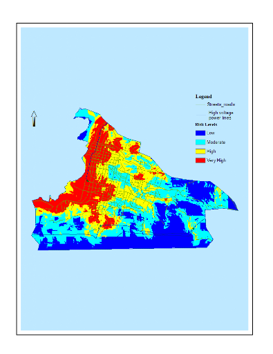
Figure 8: Environmental
Health Risks - Own weighting scheme using the quantile technique: greater
proportion of high/very high risks
|
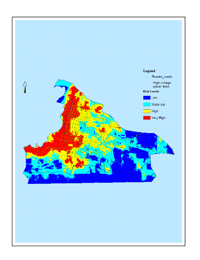
Figure 9: Environmental
Health Risks - Own weighting scheme using the geometric interval technique:
smaller proportion of high/very high risks
|
These discussions and the analysis of the combination schemes
made above illustrate the influence the choice of a specific model or technique
can have on the final results. These results can be manipulated in a certain
way to respond to decision makers' willingness to impress either about assumed
progress accomplished by an implemented project or to attract funding for a
prospective project by drawing a somber cliché of the state of the
environment. As suggested by Osaragi (2002), the selection of a classification
method depends on the nature of data and what we want to communicate about
data.
4.3 Neighborhoods Exposed at High Risks
Another important step was to focus on areas identified as highly
prone to environmental health hazards and assess their most salient
characteristics. While we can't display here all the combinations for the
different schemes, only the results obtained with the personalized weighting
scheme coupled with the natural break (chosen randomly) are displayed in Figure
10.
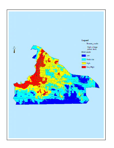
Figure 10: Environmental
Health Risks in Port-au-Prince: Percent of areas at-risk using the Own
weighting scheme and the natural breaks classification method
Twenty two percent (22%) of areas was found overlapped for high
and very high risk from one aggregation method to the other. That is, these
areas always presented high risks irrespective of the approach used to combine
the nine factors. This forms a space of certitude about the results. Most of
these areas are located in the downtown neighborhood and include all the shanty
towns. In particular these areas are well known for high traffic volume, high
population density (so housing density), are located in neighborhoods of public
facilities such as markets, hospitals, cemetery, in low elevation and near
water bodies and the sea coast. These neighborhoods deserve the greatest
attention from the government and/or the non-governmental agencies for
interventions aimed at preventing or lessening impacts on health resulting from
these identified hazards. The complete list of figures is provided in Appendix
B, Figures 21-37. Through these maps the same geographic pattern can be seen
for the different techniques considered. The differentiation, mainly
quantitative, is not substantial.
|